

Tuesday, December 30, 2008
CD cover: ChristAXX
The cover for Run the Machine by ChristAXX is exactly what the client asked for: an old American flag with a pirate skull on top of it.

CD cover: Mr Paul
Mr. Paul had a clear concept for the cover his album, Preachin With Tearz: a teardrop with a microphone inside.


CD cover: Nick Hinton (greatest hits)
Nick Hinton (who I worked with on the album The Brave Unknown) asked me for a quick cover for his 'greatest hits' retrospective album, All These Dreams. I only had a day or two, so Nick and I worked quickly back and forth, and the final cover was done in time.


Wednesday, December 10, 2008
CD cover: Steve Shape
Steve Shape requested a futuristic cover with an LA theme for his album "LATE" (Los Angeles Til the End). I've always loved Eero Saarinen's architecture for the LA Airport, so I combined it with an urban scene. The client requested blue rainbows, as well -- and there's the cover.


CD cover: Rak Batum
Rak Batum's cover ended up being one of the most unique so far. He requested a cover combining the slums of Cairo with the Pyramids, and wanted one of the pyramids to be topped with the eyeball from the back of a dollar bill.


CD cover: Doug Cash
Doug Cash wanted a simple CD cover for his debut single. It was a huge retouching effort, but turned out to be a classy cover.


Friday, November 14, 2008
CD covers: Venian and Dirty Boots
Both of these bands requested abstract cover art with some handmade-looking elements and an overall dark red and black color scheme. I tried a number of different textures and concepts for both bands but ended up using ArtRage to do abstract digital paintings for both covers.


CD cover: Running Trainer
One of six covers I did for a series of "Personal Running Trainer" podcast/albums.


Tuesday, October 21, 2008
CD cover: Scott Motyka
Scott wanted something really unusual for this album of classic heavy-metal guitar shredding, so I took the title "Cut.. ...from Within." (yes, with the dots placed exactly like that!) literally.


Tuesday, September 16, 2008
CD cover: Masaya Yamaguchi
Experimental jazz guitarist Masaya Yamaguchi sent me photos of a railroad crossing near John Coltrane's grave and asked for a simple, clean design. I used an adapted logo he sent me and put the title in Hiragino Maru, the font that's used in Japan for English-language printed materials.


CD cover: Client #9
A band called Client #9 wanted something really unusual and handmade, but also wanted to tie it into the origin of their bandname (the Eliot Spitzer prostitution scandal). I started playing around in ArtRage and did a digital painting they really liked.


Sunday, September 14, 2008
CD cover & logo: JoyFocus
JoyFocus came with a huge challenge: to create a "modern coat of arms" inspired by the Queen logo but for a fun-loving midwestern band. And this wasn't just for a CD cover, it was also to be their new 'permanent' band logo to be used on shirts, posters, etc.
I sketched on this one for days, taking elements of different heraldic symbols and assembling them together. The moment where the concept came together was when I stuck the F-14 fighters in there. When that worked I knew that I could pretty much toss anything into the mix.
The band called the end result "BEYOND AWESOME!" and I was pretty happy with it too. This might be one of my favorite album covers so far. Click to see all the details.


Wednesday, September 10, 2008
CD cover; Nick Hinton
This was a pretty huge project, but greatly rewarding. The CD cover itself was quick, but then we started in on a digital booklet for the iTunes release, and the sheer amount of work involved in all the imagery and custom design took days to assemble. The client was great to work with and the end product is something we can both be proud of; he said that I ended up creating a booklet that looked the way his own personal notebook does, which is just what I wanted to do with it.


CD cover: Bee
The R&B artist Bee sent me a great photo to use; I toned it to highlight his bright amber eyes, added the title and created a quick little bee icon. Simple and done.


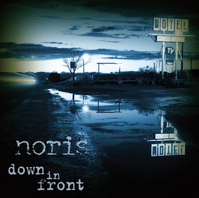
Sunday, September 7, 2008
CD cover: Noris
The alt-rock band Noris wanted a Lynchian cover with an abandoned motel. Their guitarist found this fantastic photo (which I altered and colorized quite a bit for extra creepiness).

Tuesday, September 2, 2008
CD cover: Margot
Margot, an Italian rock band, asked for a logo and album cover. They wanted me to emulate the logo for the band Rooney and do a "futuristic, weird" cover for their album Sesto Senso ("sixth sense"). From talking to them it sounded like they wanted a prog-rock sort of cover, something Storm Thorgerson would put together. They dug this image.


Saturday, August 30, 2008
CD cover: Andy
A musician named Andy requested something very specific for the cover of his album "Old Food, Old Drinks, and Andy": three vending machines side-by-side with "Cold Food", "Cold Drinks", and "Candy" on them, the "C"s having fallen off long ago to create the title. Oh, and the "Andy" machine had to be filled with copies of the cover that I would be designing. Yikes!
I found some pictures of vending machines and a rough wood backdrop...


...and used Photoshop to assemble them all together, angle the machines to be a group, add shadows, colorize things, clean the rust off of the old machines, and add the labels. Then I saved an image of the whole scene, made a bunch of copies of it, and stuck it in the "Andy" machine. The end result looks pretty cool.

CD cover: S-R.O.C.
This one was a collaboration. The client had a very specific request for a cartoon drawing of himself as a Boondocks character. Through a bit of luck, I found Jen Seng, a friend of my housemates, who happened to be an artist on The Boondocks. She drew his character exactly as described and I colorized him & placed him in this cave environment (again, as requested). Please note the 'claw marks' on the wall in the background.


Monday, August 25, 2008
CD cover: SK
SK asked for a new, fresh look at a hiphop cover, and liked this combination of rough grungy background and halftoned image.


Friday, August 22, 2008
CD cover: Dirty Sanchez
I found this crazy dude's picture for the cover of this British electronica group's debut single. Besides the title, all I added was the lettering on his headband.


Tuesday, August 19, 2008
CD cover: Lifeline Collective
This Christian rock band requested an image of souls burning in Hell while the hands of God reach down to save them. It was a Hell of a challenge but was fun layering together all the images, especially when the band requested "more flames". Woo!!
Fun fact: the tortured souls writhing in flame are actually silhouettes of people dancing at a rock concert.

Fun fact: the tortured souls writhing in flame are actually silhouettes of people dancing at a rock concert.

CD cover: The Fabulous Brothers
The Fabulous Brothers came with nothing at all: no photos, no logo, no music samples, not even an album title. They just asked me to come up with an intriguing image that was slightly sinister. It was a lot of fun working with them.


Wednesday, August 13, 2008


Monday, August 11, 2008
CD cover: Earthrise
This one was pretty straightforward; the client asked me to use a NASA photo of the Earth rising over the Moon. I did, and he said it didn't look 'real' enough, so I tarted it up with stock imagery and Photoshop effects. The end result is over-the-top sci-fi looking, but I really kind of dig it. This is a good example of when client collaboration & input really improved the end product beyond what I delivered in the first place.


Saturday, August 9, 2008
CD cover: OBEY
This one was for an alternative hiphop group called Obey the Altar Native. They had nothing for me to use and encouraged me to come up with a creative concept based around their album title and their love for designer toys and Japanese culture. I used several rows of robots swearing obedience to the "signal" from the speakers in front of them. The band dug it and I'm working on their second album now.


Tuesday, July 29, 2008
CD cover: Loose Kaynon
The cover for Loose Kaynon was a challenge. His management asked me to do a cover design that displayed a blend of African and Western cultures while having influences from pop rock, rap, R&B, and "a bit of down south hip hop". It also had to avoid any hiphop design cliches and be totally original while pitching him as not only a top-flight rapper but also a "ladies man".
I had no idea how to work all that into a design, so I put a blue splatter behind him and it worked just fine.

I had no idea how to work all that into a design, so I put a blue splatter behind him and it worked just fine.

Monday, July 28, 2008
CD cover: The Safe Harbour
The Safe Harbour, a band from southern England, asked me to give them a very "goth/emo" album cover. The one they chose is below; it was fun to do, even though it doesn't match their musical style whatsoever!


Friday, July 25, 2008
CD covers: PRX
PRX, the Public Radio Exchange, asked if I'd do not just one, but ten albums in their new digital release lineup. This ended up being a lot less work than it sounded like at first, because they already had a new corporate identity and lots of Illustrator art to work with. Once they approved my basic layout, I was able to bust the other 9 out in an afternoon. They got a sizable discount for bulk and for being awesome people to work with. I hope they need more work in the future... these guys are dream clients.


CD client: Nektarios
Electronica artist Nektarios needed the art for his debut iTunes single as soon as possible; I had to turn his design around in a day or so to make his deadline. After a lot of rapid-fire back and forth (and one of the most difficult masking jobs I've ever done on the girl on the right, who was photographed against a green shrub), here's the end product:

He was happy enough with the final design that he asked if I could turn around a logo design for his record label by the next day, as well. Yep!


He was happy enough with the final design that he asked if I could turn around a logo design for his record label by the next day, as well. Yep!
Monday, July 21, 2008
CD covers: simple ones
Sometimes a client's got a very simple cover in mind, and for iTunes, these are sometimes the best, anyway. A simple design in a tiny space can be really effective.
Lyrikal - "Here's my photo. I like silver and black."

The Precisions - "How about an mp3 player next to a jukebox?"

Scott Zartman - "I like this photo..."

Lyrikal - "Here's my photo. I like silver and black."

The Precisions - "How about an mp3 player next to a jukebox?"

Scott Zartman - "I like this photo..."

Sunday, July 20, 2008
CD cover: Ghazelles
The Ghazelles had a very simple request for their cover design: a gazelle being kicked in the face by a man doing a flying karate kick.
Can do!

Can do!

Saturday, July 19, 2008
CD cover: T.O.B.I.A.S.
A hiphop musician named T.O.B.I.A.S. asked for his album cover to be "something simple and good" that would play on the album title, Magyver (sic)-- "like music equipment, mics, speakers and stuff".
He sent this photo to use, which had a great background and lighting, but was unfortunately out of focus.

I was really stumped with what to do with this. So I started by fiddling with his photo and accidentally applying a Stamp filter to it in Photoshop, which unexpectedly looked great. For the "MacGyver" effect I added some ramshackle clipart of speakers, music equipment, buildings, etc, and gave his name a funky 3D effect. I ended up sending four different concepts, but the first sketch -- the one he chose -- was done within half an hour of opening Photoshop. Sometimes these things just fall together right off the bat.

CD cover: Sully
A musician named Sully asked for his CD cover to have "an image of a bottle of tequila with the full moon behind it" to go with his album Tequila at Night.
Since nothing like that exists on stockphoto sites, I was Photoshop bound. The moon was a cheap stock image and the sky was a cinch to create; luckily my roommate had bought a bottle of Patron tequila recently, so I shot it in my bathroom against a black dress shirt.

But a bottle doesn't just float in space with the full moon behind it, so I had to give it a setting, too. Having no idea what sort of music Sully plays, I figured tequila would go well with a nighttime party setting, but since the bottle and moon (and title) still needed to be the focus, I figured a carpet of sparkling lights surrounded by mountains would look good. So I found this postcard shot of Rio:

Great. Now for lots of compositing work and fiddling with transparency effects. I stuck the bottle on a "table" made of a piece of marble-textured glass.
The result made the client very happy:

Subscribe to:
Posts (Atom)